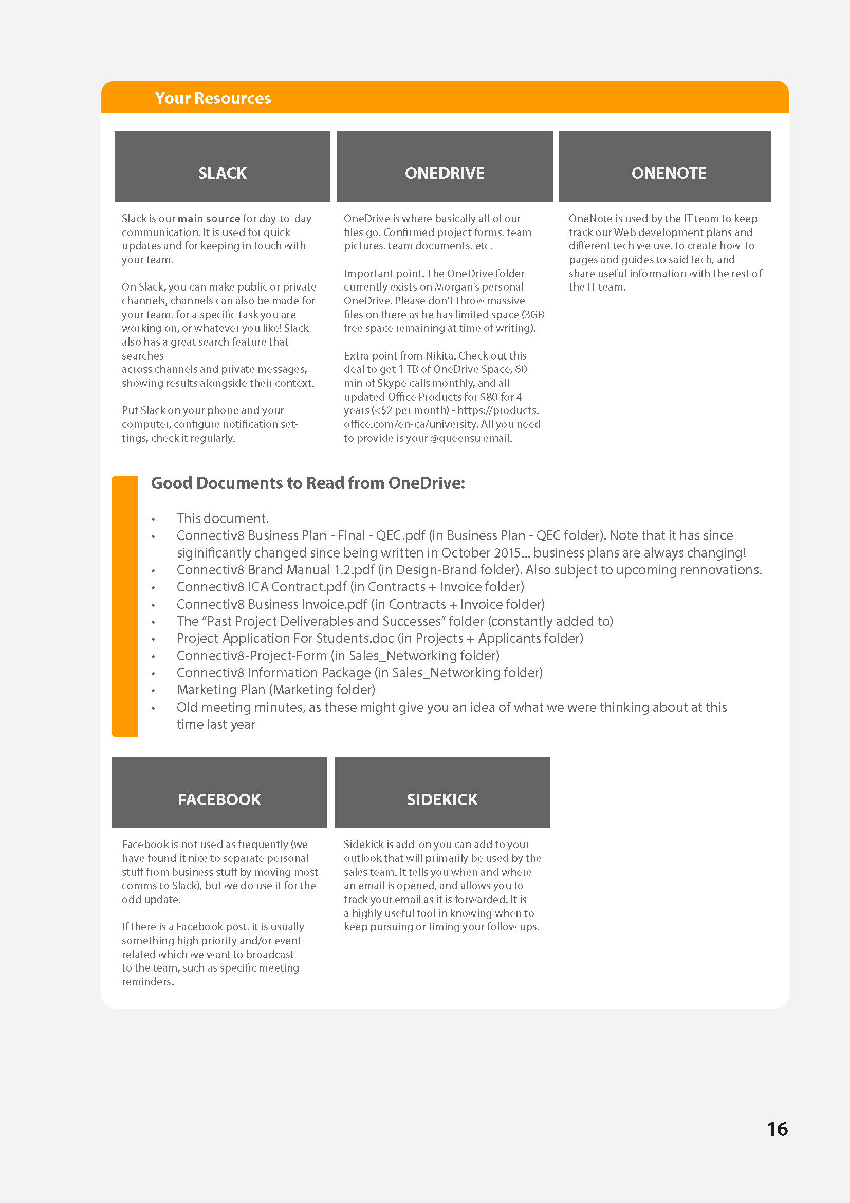
LINKS:
Website: www.connectiv8.com
Facebook: @connectiv8
Facebook: @connectiv8
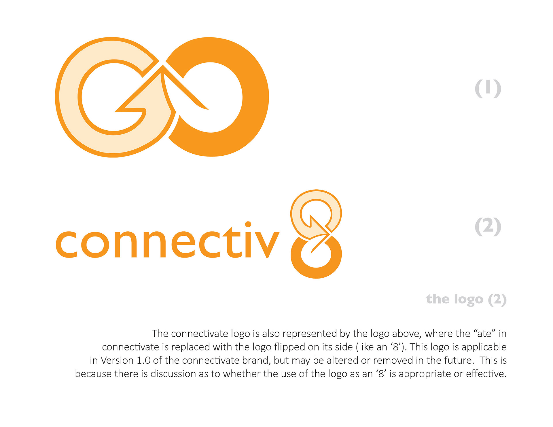
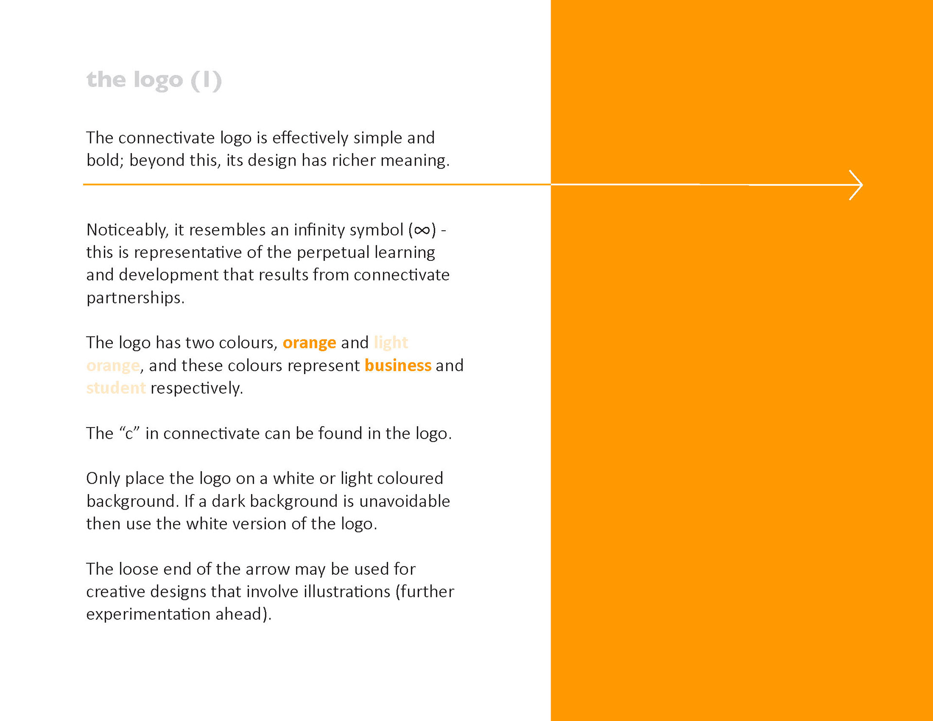
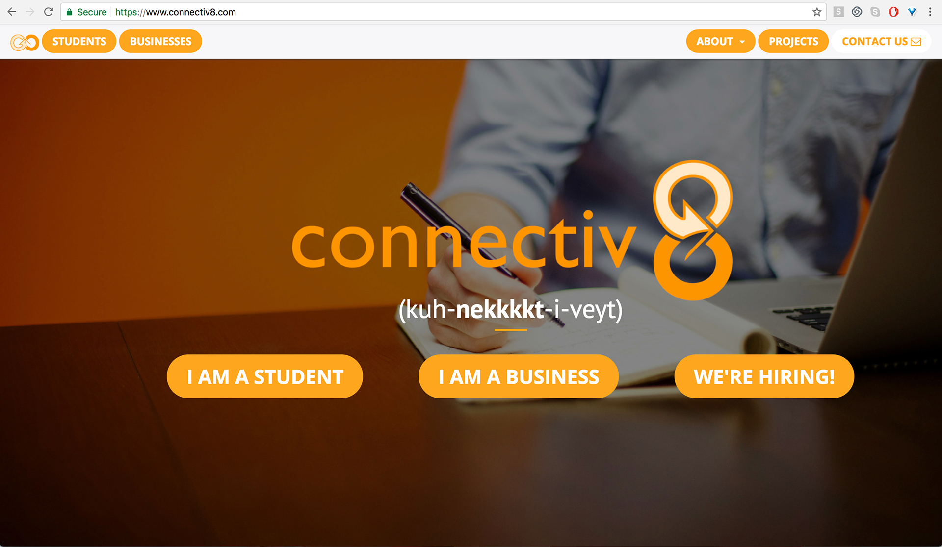
Full Connectiv8 Logo - Note the use of symbolism, an infinity symbol, flipped on it's side to create "ate" as the number '8'. The trademark symbol for Connectiv8 is the infinity symbol, representing businesses and students in collaboration with each other.

Fun team photo with logo watermark.

Team portrait photo with logo watermark.
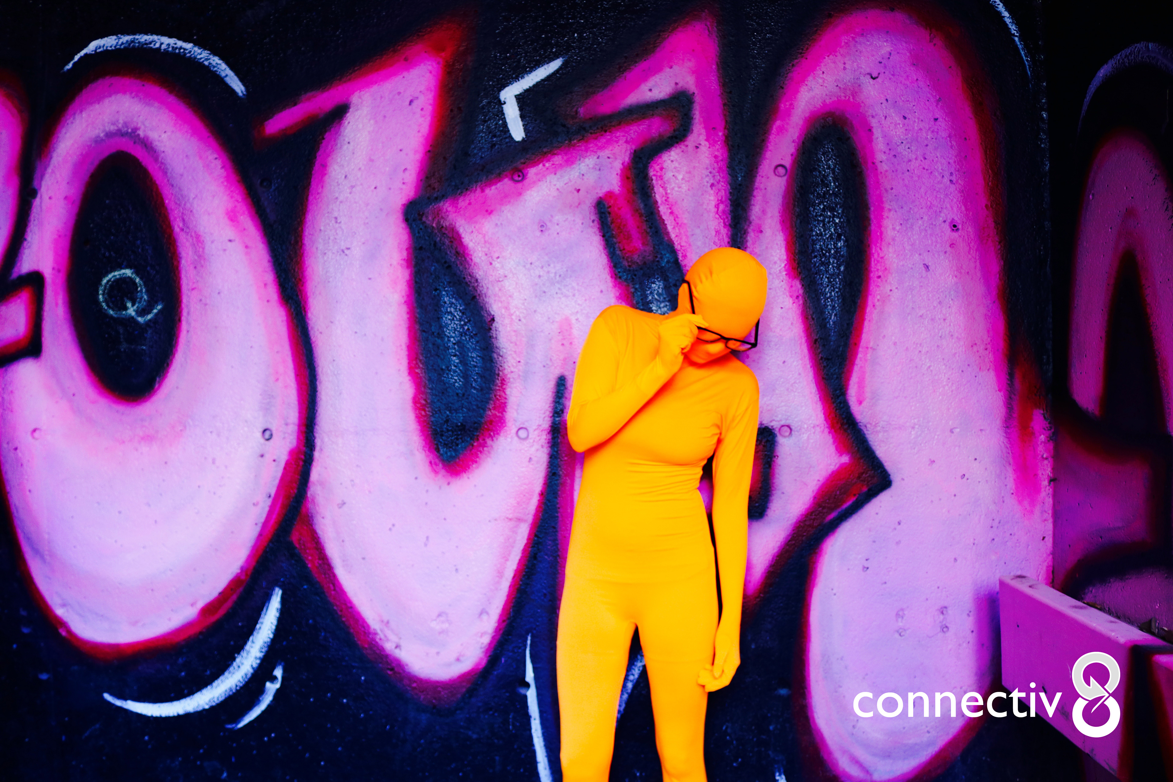
Promotional image used for Connectiv8 Marketing Week in March 2016.
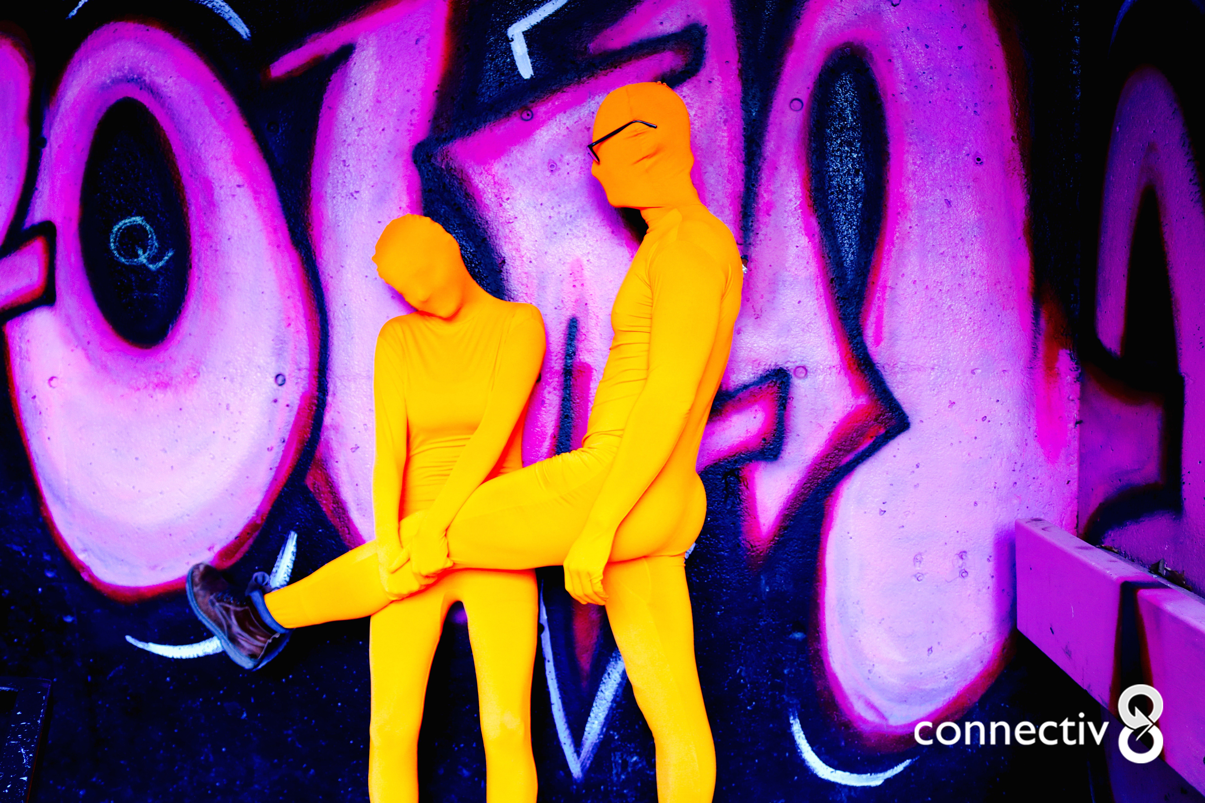
Promotional image used for Connectiv8 Marketing Week in March 2016.
Promotional image used for Connectiv8 Marketing Week in March 2016.

Project form created for Connectiv8 participants to fill out online, link found on the Connectiv8 website (www.connectiv8.com). Businesses are required to fill out this form before any project may be posted on the website. With this form, design was important, as all client touch points are considered branding opportunities.
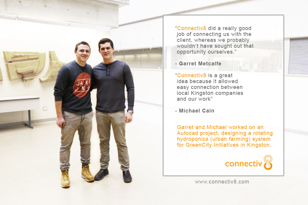
Graphically enhanced photo of students for visually appealing Connectiv8 feed content. These students completed a project and were interviewed by the Connectiv8 Marketing Team.
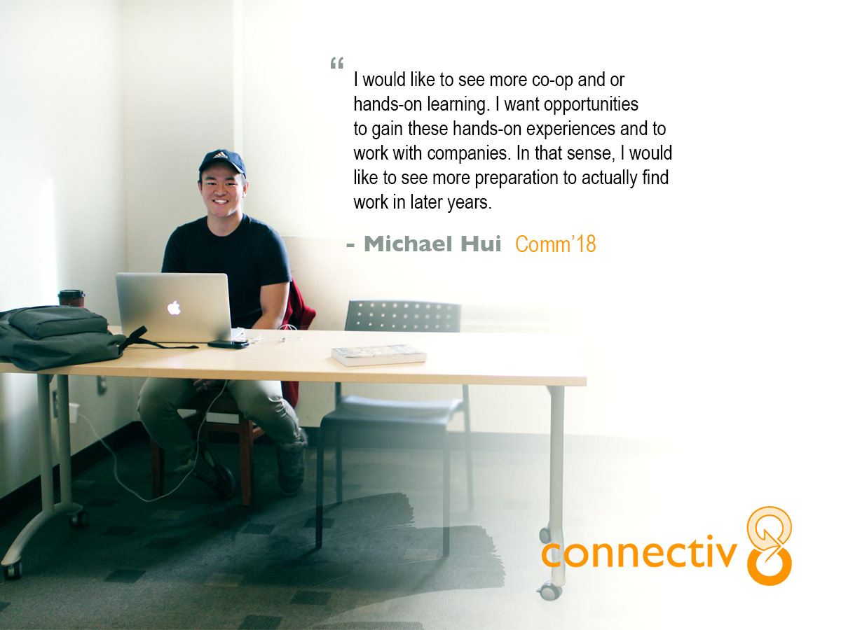
Graphically enhanced photo of students for visually appealing Connectiv8 feed content.
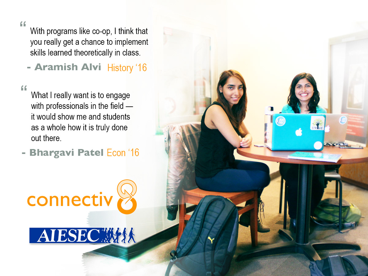
Graphically enhanced photo of students for visually appealing Connectiv8 feed content.

Graphically enhanced photo of students for visually appealing Connectiv8 feed content.

Promotional image used for Connectiv8 Marketing Week in March 2016.
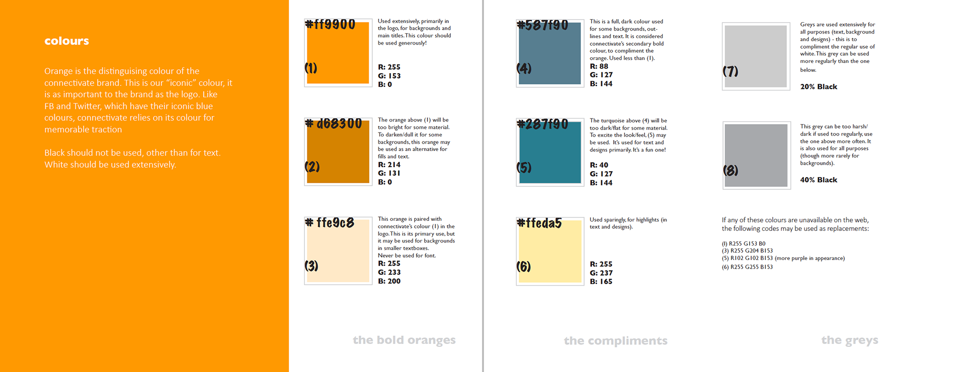
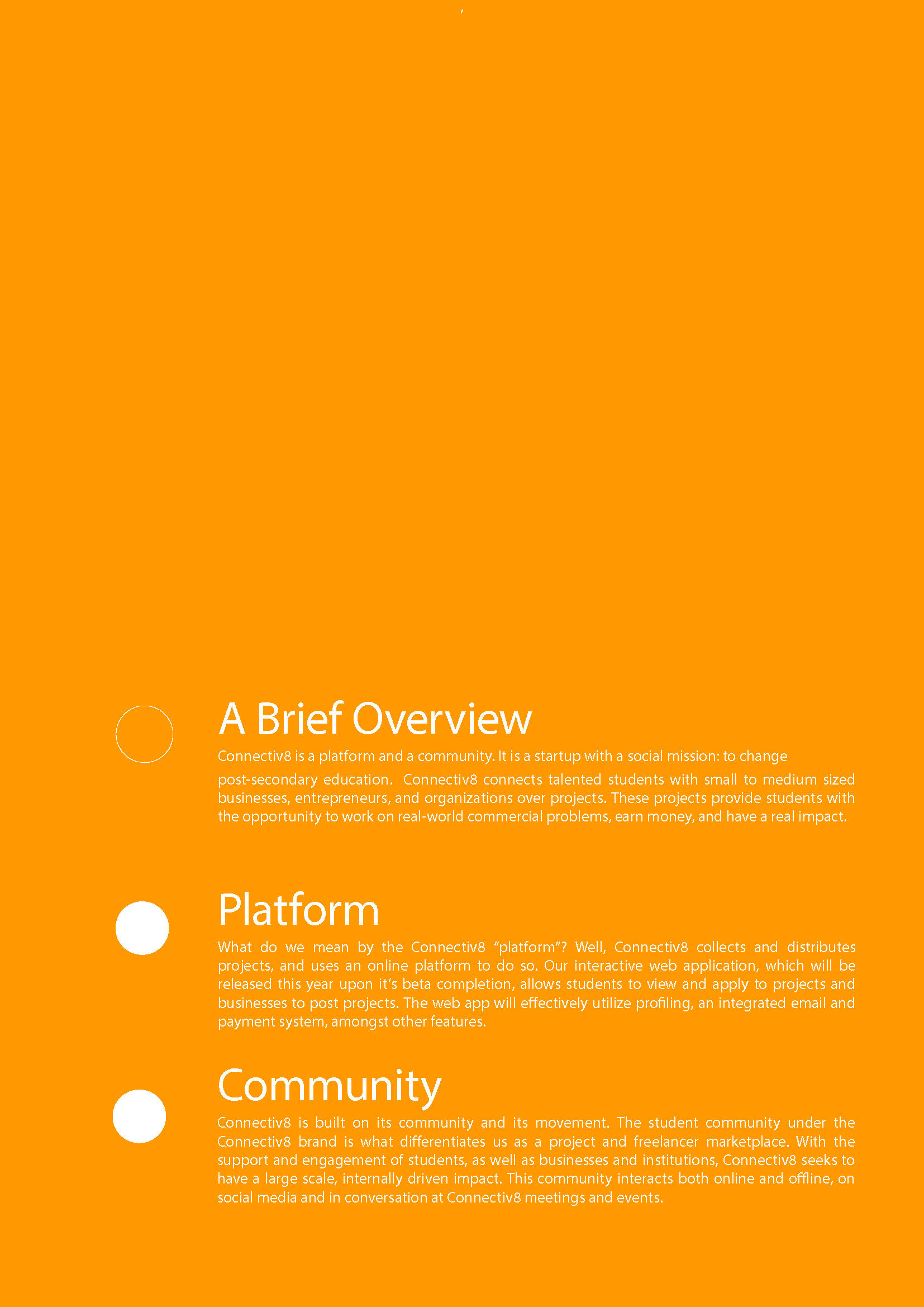
Image taken from the Connectiv8 Brand Manual Version 2. Branding has been important for Connectiv8 since it's beginnings, because Connectiv8 is user intensive. In order to attract students, and businesses alike, Connectiv8 relies on clear messaging, bright colours, and vibrant content. This manual has since been updated, and is in continuous development and refinement.
Numerous small, simple eye-catching typographic ads have been put out by Connectiv8, onto our feeds (such as Facebook). Images are always more effective than text at catching the attention of potential users.

Numerous small, simple eye-catching typographic ads have been put out by Connectiv8, onto our feeds (such as Facebook). Images are always more effective than text at catching the attention of potential users.
Connectiv8 Transition Manual created for the incoming Connectiv8 Team at Queen's University, 2016. All content and design.


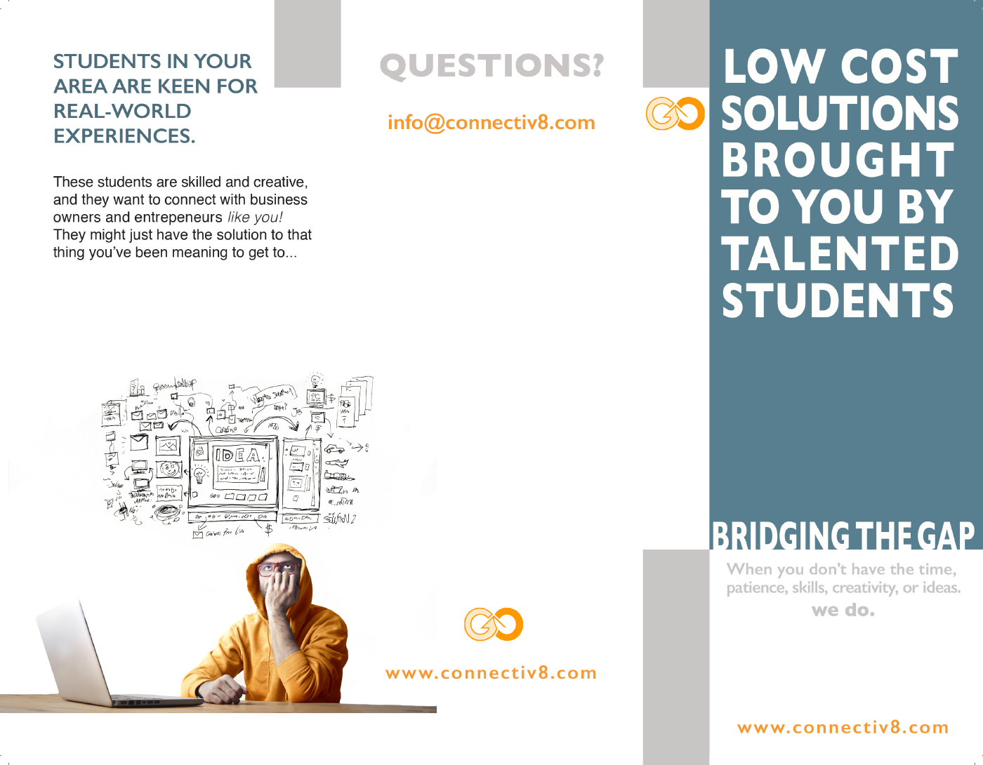
Snapshot of an unfolded, early brochure released by Connectiv8.
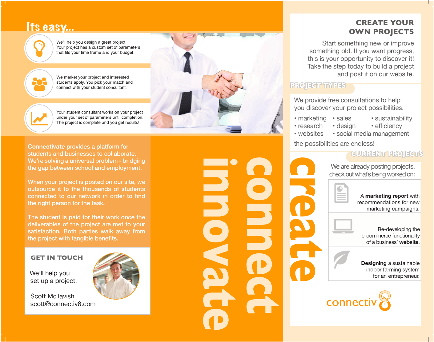
Snapshot of an unfolded, early brochure released by Connectiv8.